The brief
A new investment app needed to look dependable to first-time investors in smaller towns, an audience that treats anything flashy with suspicion.
What we did
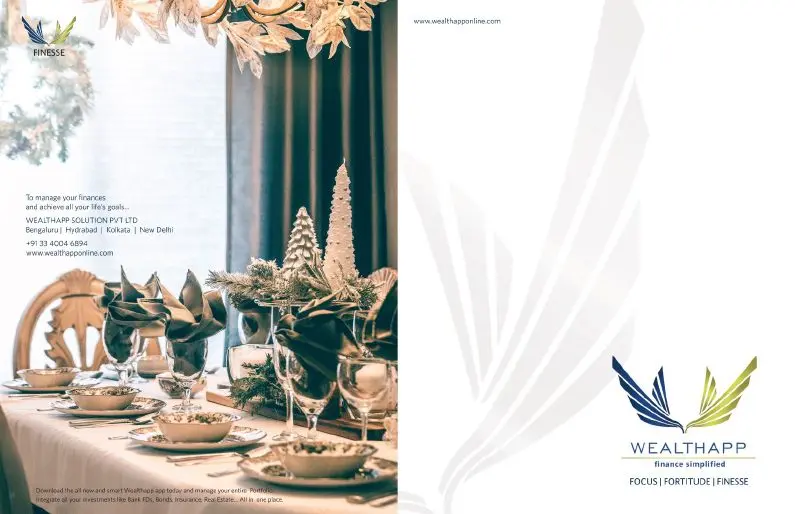
We kept the identity plain and the product screens uncluttered, then carried the same restraint into print: a wall calendar, branch standees and launch banners that looked like they belonged to a bank, not a start-up.
Outcome
A complete launch set: app interface design, brand identity, print collateral and on-ground promotion.